HOW TO SIDESTEP A BUDGET CUT
Many organisations, particularly those in government, face stringent cuts to their budget.
How can you deal with these pressures powerfully, in a climate of increased expectations?
The key lies in identifying areas of hidden non-value-adding activity and under-utilisation.
Here’s how to go about it:
1. Get a clear picture of the current ‘as is’ situation, especially as far as costs are concerned: do you know what your unit costs are (as distinct from your total operating costs)? If not, find out. For governments, the Report on Government Services produced every year by the Productivity Commission (www.pc.gov.au/gsp/rogs/2013) is a good place to start. For example, that report shows that for 2011/12, the cost per person on general practitioners for primary and community health ranged between $189 (in the Northern Territory) and $321 (NSW). Ideally this can be plotted against a measure of service quality or customer satisfaction, in a 2x2 matrix like the one below:
Cost per Patient vs. Patient Satisfaction: Primary and Community Health, 2011/12
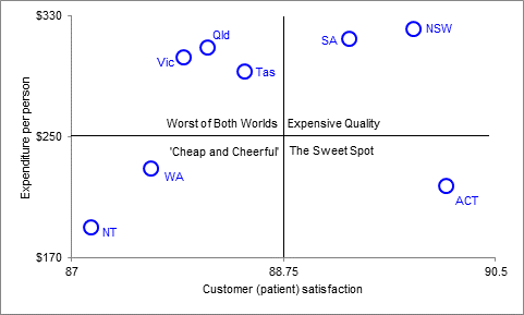
source: based on data from www.pc.gov.au/__data/assets/pdf_file/0005/121775/17-government-services-2013-chapter11.pdf
2. For a given level of budget cut, calculate the affected number of units. For example if funding is being cut from $50 million to $45 million (for argument’s sake) and the unit cost is $300 per person, then the number of notionally affected people is 16,700 (ie. 50m minus 40m = 5m, divided by 300, gives 16,666 which is rounded up to 16,700). This is the potential service impact to be accommodated by the cut
3. Collaboratively map your main processes; ensuring you actively ‘walk the process’ both forwards and backwards (pretend to be a customer), take baseline measurements of turnaround time (the amount of time it takes to complete a service from start to finish); completion rate (number of work items completed in a given period of time) and the customer demand rate (outputs required by customers in a given period of time)
4. During the process mapping, identify those areas of greatest under-utilisation or non-value-adding. These are shown by overprocessing and overproduction; unnecessary movement of people, products or information; work produced in excess of requirement; and delays and waiting time; rework arising from defects or errors. In many services, costs are inflated between 30 and 50 percent because of these kinds of non-value adding
5. For each step in the process map, calculate the proportion of the total turnaround taken up by value-adding time. This figure is known as the process cycle efficiency (PCE)
6. Identify those process steps which represent the biggest improvement opportunities. A rough rule of thumb here is that if the PCE is less than 10 percent it is ripe for improvement
7. Of these processes, workshop the causes of the non-value-adding by using a technique based on asking the question ‘Why?’ five times (the so-called 5 Whys technique made famous by Toyota)
8. For these selected processes, if the cause is the complexity of the process, explore and implement solutions based around standardisation and modularisation, or ‘pipelining’ the process by ironing out ‘kinks’ from re-work. If the cause is bottlenecks from high volume, look at triaging incoming work based on priority; deploying resources functions from functions with low utilisation to those which are highly utilised. Alternatively, look at eliminating functions that cause delay without adding value. Pilot improvement initiatives before full roll-out
9. Estimate the benefits: size these up against the service impacts identified in step 2
10. Use a schematic such as the one below to communicate cost performance and projected or estimated service quality/customer satisfaction improvements to key stakeholders. (Note here that the data used are real data on community health, while the improvement in red is indicative only)
11. Maintain gains by capturing new processes in formal procedures and by using visual process controls such as wall-mounted scorecards and charts.
Cost per Patient vs. Patient Satisfaction: Primary and Community Health, 2011/12 Showing Indicative Cost Improvement
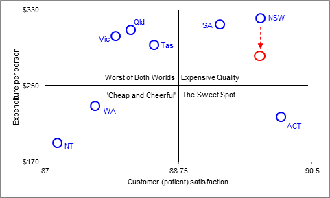
source: as per previous graph; improvement in red is indicative only.
* * *
The steps outlined above represent a rigorous and considered method to handling cuts, without the negative impacts on service quality of blanket approaches such as wholesale staff freezes or across-the-board cuts.
In fact, the steps set out above can even lead to enhanced service quality and customer satisfaction in a time of budget restraint.
If you would like to be on the front foot in dealing with a cut to your budget and need some assistance, contact me on phone 0414 383 374 or by return email.
I look forward to hearing from you.
With best regards,
Michael Carman
Director | Michael Carman Consulting
© Michael Carman 2013